Bringing a Museum Back to Life
- UI/UX DESIGN
- USER RESEARCH
- COPYWRITING
Overview
In the wake of the pandemic's impact on museum re-openings, I undertook a project to help the Fire Museum welcome back loyal visitors and entice newcomers.
This project is a heartfelt effort to revive the museum's spirit and share the joy that I felt when I used to visit.
Client
Memphis Fire Museum
Year
2020
Main Goal
The goal of this project was to build an eye-catching site that informed visitors of the museum’s offerings and allowed museum goers the ability to book tickets online.
Process
By employing design thinking methods, I conducted observational research with museum visitors, created lo-fi wireframes based on their response, tested these wireframes with potential museum visitors, and then created a hi-fi wireframe delivered to the museum manager.
Outcome
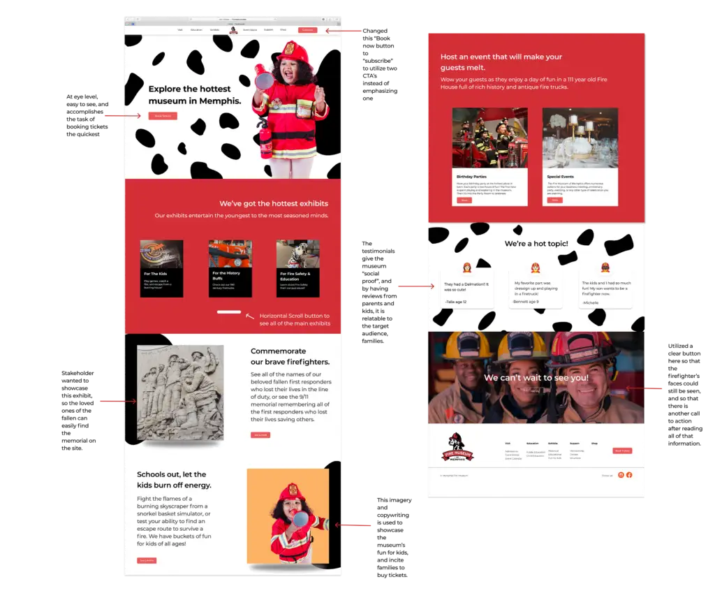
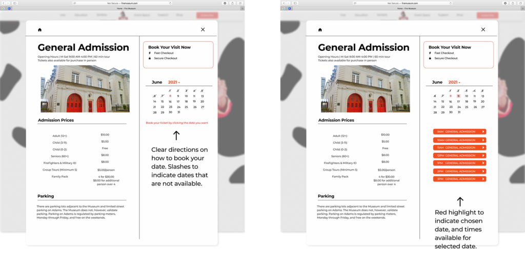
The final result included a landing page and booking pop up designed to decrease bounce rate, engage users, and serve as a one-stop shop for the most important information about the museum.
The new site succeeded in allowing users to book tickets online, find visiting hours, and visually enhanced the user’s experience. It was even kid approved by 4 year old Jayce who said ” I wanna go there and ride a fire truck and be a fireman!”
User-friendly
Engaging
informative
Initial Audit
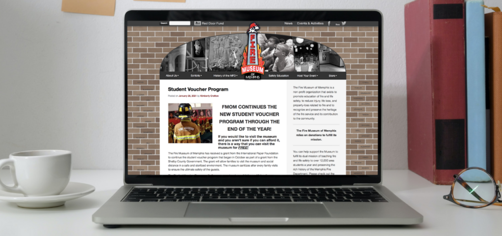
The original site had a brick background that was a bit distracting. The brick background was supposed to resemble the memorial for fallen firefighters with their names engraved in the brick, but it was hard to see. The Admissions details were missing from the top of the page and the drop down; however, it was located on the bottom of the page which made it hard to find. The site also has no call to action in the header, and it doesn’t visually showcase all of the exhibits to visit. .
User Interviews
Wireframes
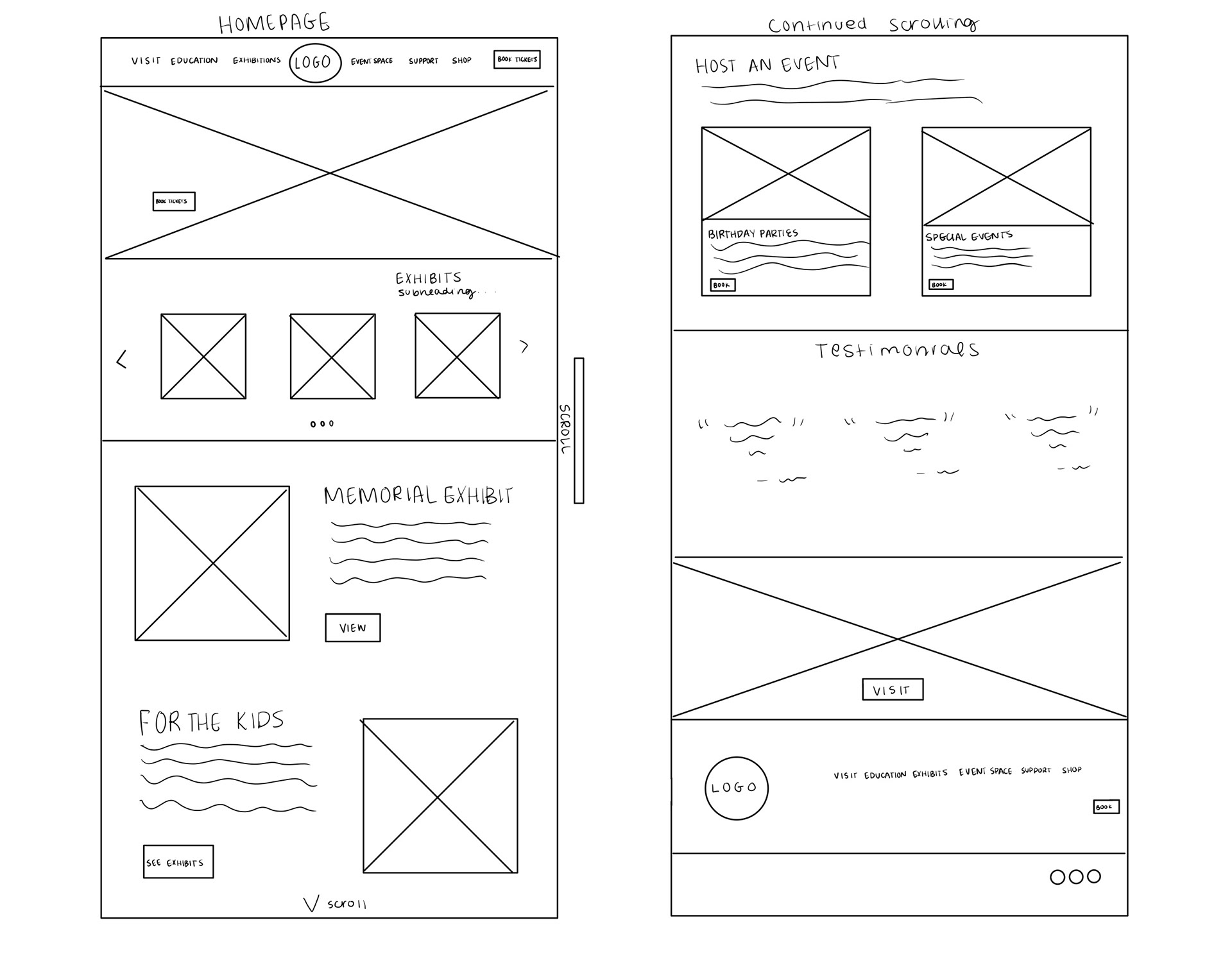
Leveraging insights from competitive analysis and user research, I crafted streamlined wireframes. Inspired by local museums, the homepage prioritizes vital information, while the out-of-state fire museum’s approach influences categorized exhibit showcases. Hero images now feature prominent Calls-to-Action, ensuring a seamless user journey.
Booking Pop-up
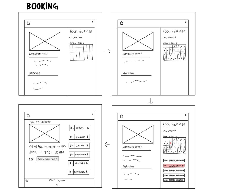
I put the admissions prices and times on the left hand side, to provide users a quick glance before committing to tickets. Unavailable dates are visibly slashed, while the current date pops in red, ensuring clarity at a glance.
Usability Testing
When conducting user testing on the wireframe, I found that 100% of the users were able to find visiting times, exhibits, book events, and find the ticket price, but the buy ticket feature had a 66% fail rate. As a result, I decided to add some copy to the ‘book tickets’ feature to help guide the user through the check out process.
Hi-Fi Wireframe
