Refreshing a Brand Revolutionizing Martial Arts Apparel
- BRAND DESIGN
- WEB DESIGN
- COPYWRITING
Overview
Revolutionizing martial arts fashion for women, Wicked Rose is redefining comfort and sustainability in every stitch. My team and I worked hard at Brandathon crafting a brand that communicates their mission.
My responsibilities for this project included conducting market research and industry analysis, crafting the brand identity, and copywriting. We all presented portions of the powerpoint on pitch night!
Client
Wicked Rose
Team
Ky Lee - Graphic Designer
Chloe McNeil- Brand Strategist
Crystal Koo- UX Designer
Year
2022
Main Goal
Bombshell Boxing is evolving into Wicked Rose, a name that echoes inclusivity and power. They want a website and brand identity that ties in their mission, and values. They’re breaking free from gender norms and creating a space women can express themselves in martial arts without settling for ill-fitting gear. Bombshell Boxing is redefining standards and is in need of new branding to help do the job.
Process
My team and I worked hard all day and night during our Brandathon weekend
- Conducting market research and competitive analysis, and brainstorming ideas for the new brand identity
- Meeting with mentor judges and the founder to receive feedback and implement changes into the sketches
- Develop the final deliverables of a logo, brand personality, typography, and website design
Outcome
After presenting the brand to the judges and founder, we received first place! Wicked Rose is now thriving and has released their apparel. Check it out here
1st place
Meet Wicked Rose
Mission: We want YOU to take control of your own narrative, ensuring that you are well fitted to fight your fights by providing comfortable, full coverage, eco-friendly clothing.
Partnering with tattoo artists, we celebrate the synergy between martial arts and tattoos – both powerful forms of self-expression. Our apparel seamlessly blends these art forms, ensuring you’re fit for your fight.

Brand Strategy
Logo
The new logo is simple and dynamic, designed to shine across diverse touch points. It’s not just a visual; it’s a nod to tattoo culture with a universal appeal. Fun Fact: tattoo artists collab with the brand and and add their stylistic take creating a new emblem for each apparel item.
The roundness of the rose exemplifies The rounded shape of the rose isn’t just about aesthetics – it radiates the approachability and authenticity of the brand. But here’s the twist – nestled within is a hidden snake, a subtle nod to empowerment. Beautiful as a rose, yet with a hint of edge. Mess with us, and you might just get bit. It’s the perfect blend of pretty and powerful.
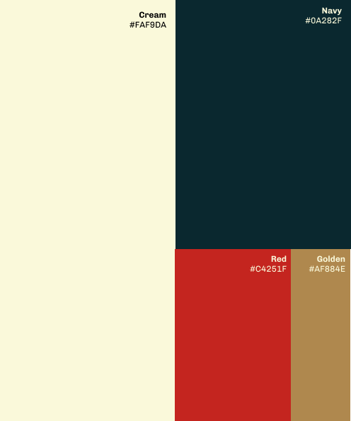
Brand Colors
Our Wonder Woman palette exemplifies our brand values of self-expression, empowerment, authenticity, and sustainability.
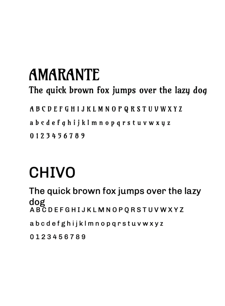
Typography
The Amarante font expresses the creative nature of the brand. It’s this beautiful fusion of soft and sharp, mirroring the duality of our name, Wicked Rose.
Chivo is a san serif that adds balance to the intricate Amarante type.It steps in with its clean lines, offering that perfect balance. Not only does it keep things polished, but it also makes sure the message is crystal clear and easy to read.
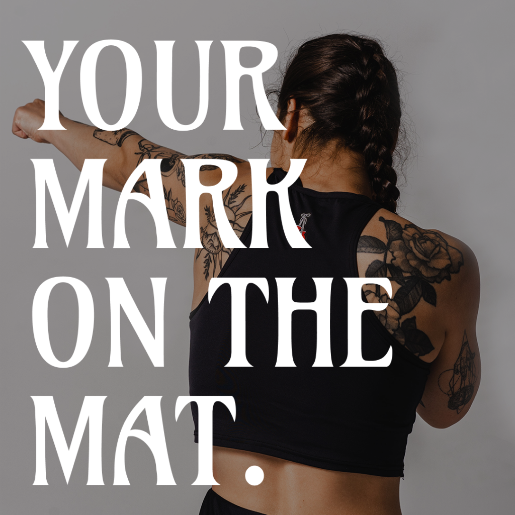
#YourMarkOnTheMat
#YourMarkOnTheMat is a social media campaign with the goals of building community and creating brand recognition. It’s a community call-to-action to share stories, flaunt moves, and embrace individual fighting styles. Because in the world of Wicked Rose, every story matters, and every move is a masterpiece. The purpose is to inspire others to leave their mark on the mat, and use Wicked Rose as a vessel to do so.